
We were honored and delighted to have "Men & Women: Getting Into Each Other's Genes" receive the award for "Best Book Cover Design" in nonfiction from The Book Designer in June! There were lots of terrific entries. I am especially grateful the book received the honor, because I am not a graphic designer, just a girl on a budget. It was basically my first "solo flight" in book cover design. (I had a lot of help on my first book cover for "Aging With Ungirdled Passion" from my very talented graphic designer friend Lucy Thacker). While I really like how the "Men & Women" cover turned out, I must confess it took quite some time to get there! Fortunately, I had valuable input along the way. Here, I will take you on my clumsy journey to the final design! By the way, for my fellow authors, I have found thebookdesigner.com to be a FABULOUS resource for expert advice and inspiration!
First, a little background. While I wrote "Men & Women's Genes" with my hilarious brother Bob Nery, sharing the writing 50/50, it was agreed I would handle the cover design solo. Since ours is a book of humor essays taking a balanced and seriously tongue-in-cheek look at the differences between the sexes, we wanted a cover that instantly conveyed "humor" and would appeal to both men and women. My research (and my gut) told me more women would buy this book than men. Still, because it's a perfect gift for a guy's birthday, anniversary, Christmas or Father's Day, men needed to feel comfortable being seen with it. I set to work using InDesign to try to come up with something.
Initially, I thought the cover should "jive" with the cover of my first book. (We girls love for things to match!) The cover of "Aging With Ungirdled Passion" features the illustration of the "ungirdled woman" created by my very talented artist friend Vicki Bruner who graciously allowed me to use it both for the banner of this blog and the cover of the first book. I thought another of Vicki's illustrations (and the same font) would be a great way to add cohesiveness to my "line" of two books. Vicki did the following illustration for a line of greeting cards we produced together. I thought it would be ideal. Hence, my first rough mockup:

Yeah. I know. While it conveys humor, it's too "cutesy" and not polished enough. Back to the drawing board. Here's the second try with a stock illustration from iStock:

To me, this design was less "cutesy" and cleaner than the first design, but it almost looks like it's a clinical guide to behavior in the sexes. Not the message we wanted to send. We chose the title "Men & Women: Getting Into Each Other's Genes," because the differences between the sexes seem to be innate. We also thought the play on words "getting into each other's jeans/genes" would be fun. Why not use an illustration with jeans? Perfect!

OK, the third time was not the charm. While it's headed in a better direction, I realize I need help. I ask good friend and graphic designer extraordinaire Liza Gibhardt if I could pay for two hours of her time to help me polish it. She reports her schedule is too overloaded to take on another project at the moment, but she is happy to take a look as I go along. Off the bat, she suggests making "and" an ampersand and "Men & Women" smaller in the title. Why didn't I think of that? She also suggests marrying the symbols for male and female together in a design to see how that works. Both she and Bob suggest a photo of a couple with their hands in each other's jeans (genes). Since a cover shoot is not in the budget, I go back to looking through stock photos. "You'll get there," Liza encourages.
First I consider Liza's idea about marrying the symbols for male and female. In trying to "flush out" ideas, I realize the position of the toilet seat provides more downs than ups in the male-female relationship. It's gotta be THE hot button issue between the sexes. I try this idea:
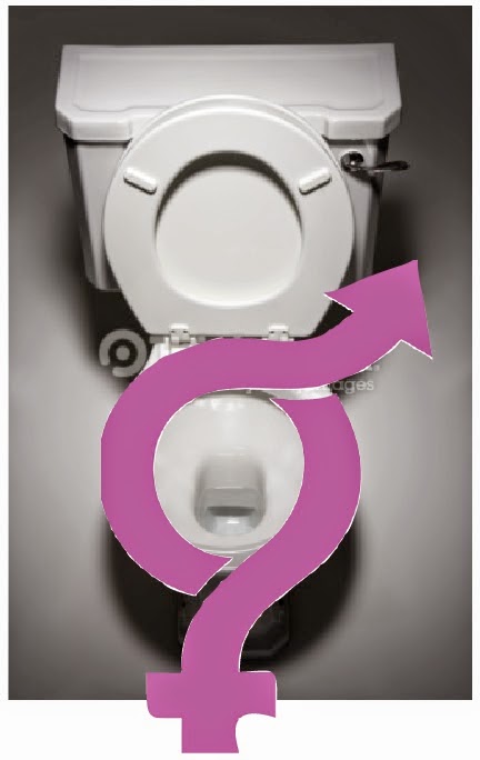
Nope. Gotta "can" this one! Too "Spencer's Gifts." Not what we're going for. OK, I'll look at photos of men and women getting into each other's jeans (genes).

Hmmm... the photos I'm finding are a little too "hot" for my purpose. They would make an intriguing cover, but seem to convey romance over humor. Also, the subjects in the photos I'm finding are too young. We don't want to turn off older readers. (I guess there's not a big market for photos of topless and frisky old folks.) We need something that appeals to couples of all ages. I also need something tamer that conveys humor. I know! I'll see if I can find a tamer couple in jeans and use thought bubbles to convey their different points of view!

Better. But still not loving it. It's also race-specific which I don't like. I'm also not liking all the type under the title. I need to think of something not age or race-specific and something cleaner. I play around in InDesign a little more.

OK, I LOVE this! Much cleaner, not race or age specific, and I think it conveys humor. It reminds me of something I've seen before... I know! It kinda reminds me of the cover designs on some of Jen Lancaster's popular humor books for women. I'm kinda proud of myself. "This is a great cover," I think. I send it to Bob and Liza. Bob replies, "It looks like a baby shower invitation." Next I hear from Liza. "I like it. You're getting closer. What does Bob think?" I tell her he thinks it's too girly. "You're almost there. You've got this," says Liza. OK, I am not as slick as I thought. I try to "butch up" the design:
I don't like this at all. Too much going on. Sigh. Back to the drawing board again. I am thinking of perhaps using a stock illustration now instead of a stock photo after the problems I was running into with photos being too young, too hot, and/or too dated. I do more searching through stock photo companies' inventories.
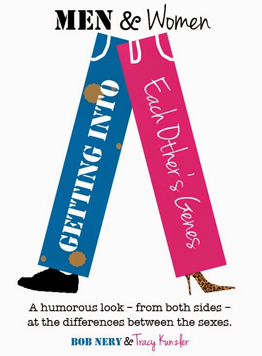
I find this illustration I really love that I can license from iStock. It's titled "Adam & Eve" which is perfect, as the problems that arise from the differences between the sexes are as old as time! To me, this illustration conveys humor without locking into a specific race or age group. I try it out in a cover design:

I really like it, but I'm not loving it yet. I play around with size and fonts a little bit...

There! By George, I think I've got it! I like the font in varying sizes between the two figures. I started with the type in stark black, but I found I like it better in charcoal gray, as it seems to go better with the almost pastel figures. I play around with the subtitle a bit, and I think we have a final version! I send it to Bob and Liza. "That's it! Perfect," says Bob. "I knew you could do it," says Liza. Glad she knew! I was having serious doubts! I purchase the license from iStock. We publish the book, and it gets to the #3 spot in "hot new releases" on Amazon in our genre during the first couple of days! We also get lots of compliments on the cover. I nervously submit it to The Book Designer Awards. We win "best nonfiction cover" in June! I'm over the moon!

Thanks for coming along on the bumpy but successful ride. They say it's not the destination but the journey. I guess that's true. It's good to have talented and honest friends (and plenty of Krispy Kremes) along the way! The lesson I learned was not to settle too quickly and to ask for feedback throughout the process!


That was so interesting!
ReplyDeleteThanks for sharing it w/ us.
and...Congratulations!